
Why Should You Invest For The Long Term
It is often said that investors should invest for the long-term. But why? This post aims to look at how investors would have fared investing over differing periods. I will show you why investing for long periods gives you a better chance of success than investing over shorter periods.
When investors talk about investing over the long term or short term, they are referring to the amount of time that you leave your money invested before selling the investment. If I invested today and sold it tomorrow, that would be very, very short term. If I invested today and sold in 30 years, that would be considered long term.
Investing is inherently uncertain. No person can guarantee that today is a better day to invest than tomorrow will be. No-one can forecast the future with any degree of certainty. An investors job is therefore not to try and do the impossible task of predicting the future. An investors job is to try to tilt the odds in their favour. They hope to merely improve their chances of getting it right and reduce their chances of getting it wrong. Investing for longer is one of the ways of increasing your chances of getting it right. Let's do some analysis to see why:
To understand this better, we are going to look at the past and see how our investments would have performed. We are going to look at a range of different periods to see if certain periods give us a better chance of success than others. For example, if I had invested for 1 year, would my investments have performed better than if I had invested over 10 years.
We quickly run into problems here though. Which 1 year or 10 year period do we pick? The difference in return for a good 1 year period and a bad 1 year period will likely be huge and picking the wrong one could skew our results.
To avoid this, we want to look all the 1 year periods as far back as we have data for. We will start at the first data point we have and look at what our return would have been 1 year later. We then move on to the second data point we have and look at what our return would have been 1 year later. And so on until we have covered every single 1 year period over the time we have data for. By doing this, we can work out how many of those periods gave us positive returns and how many gave us negative returns. We can also look at the average, best and worst returns.
We will then repeat this whole process for a 3-year time horizon. And again for 5 years, 10 years and so on.
This is likely to get pretty boring and repetitive so I have written a python script to do all the hard work for us. Here I am using monthly data from the MSCI All Country World Index (Gross GBP).
Here are the results for a time period of 1 year:
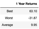
Shown in %. Gross monthly data for the MSCI ACWI in GBP. Source: MSCI website
As you can see, in the best 1 year period, the index returned over 63%. In it's worst year, it lost nearly 32%.
Now, lets add on the results for 10 years:
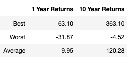
Shown in %. Gross monthly data for the MSCI ACWI in GBP. Source: MSCI website
The best year got a lot better and the worst year got a lot less bad. The average return also shot up. Here we can see that investors who invest for 10 years, in the past, would have had a much better experience than those who invested over 1 year.
Here are the results up to 30 years:
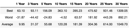
Shown in %. Gross monthly data for the MSCI ACWI in GBP. Source: MSCI website
As you can see, the longer you invest for, the better your chances of success. If you had invested for 15 years or more, you would have never lost money. This is no guarantee that you would not lose money in the future over 15 years. No-one knows the future. However, this data shows us that investing for longer periods improves your chances of a good result. That is all we can hope for as investors.
This data by itself is pretty ugly, so let's try and make it look a little bit nicer. Here is the same data as above, but shown as a graph. For each of our time horizons, we can see the best return (blue line), the worst return (orange line) and the average return (green line).
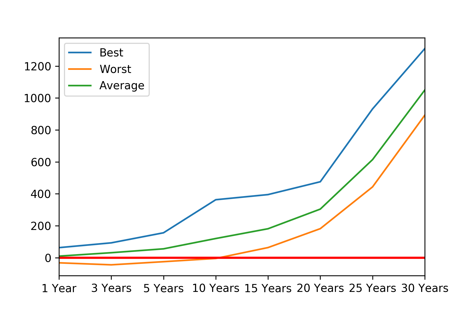
Again, we see that the longer you invest for, the better the chance you have of a good result. The red line horizontal line indicates 0% returns so you can see that somewhere in between 10 - 15 years is the sweet spot where all returns where positive.
Whilst useful, the best, worst and average returns hide a lot of information. With just these three data points we can't tell if the best returns were just wild one-offs or whether the index frequently gave high returns. It would be useful to see all of the data in one chart to give us a more complete view. To do this, we will look at two areas:
- The percentage of positive and negative returns (using an area graph)
- The range of returns (using histograms)
Let's start with the first. Here I will write a script that looks at each of our time horizons and works out the percentage of the returns that were above 0% - 'up years' - and the percentage that were below or equal to 0% - 'down years'. Here are the results in a table:
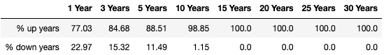
Again, we see that longer-term is better. We also see that stocks are a fairly 'asymmetric' asset class. That is to say that their returns tend to be bigger than their risks.
Next, we will run the same analysis and put the info into a graph. For completeness, I am going to tweak the script to give us the results for every single year time-period. So rather than show 1 year, 3 years and so on, we will have the data for 1 year, 2 years, 3 years etc up until 30 years.
Here are the results:
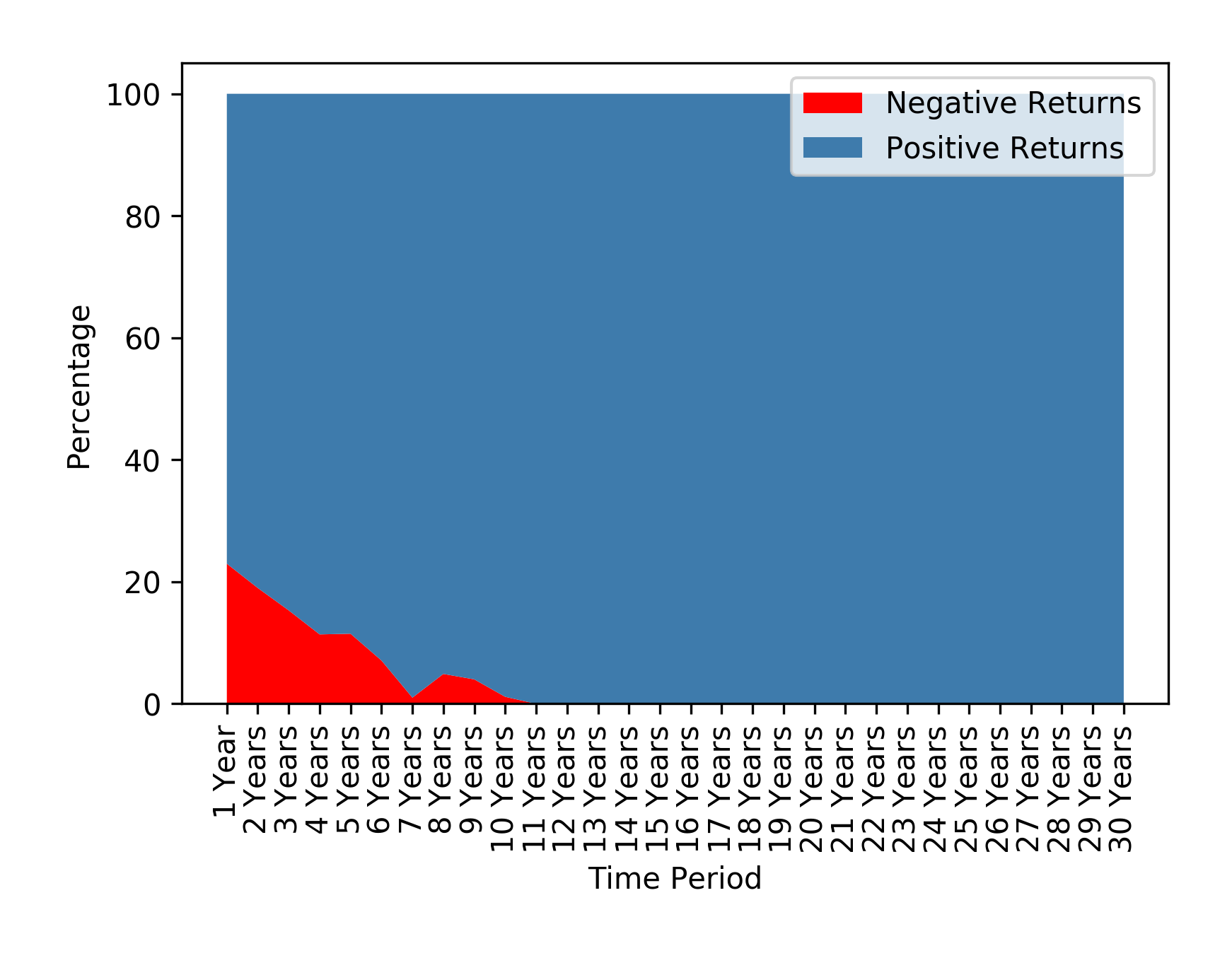
The red area shows us the % of negative return years. The blue area shows us the % of positive return years. For example, when you look at the 1 Year results the graph tells us that just over 20% of the time stocks lost money. The rest of the time they made money.
Again, we see that stocks tend to make money more frequently than they lose it. We are also reminded that the longer you invest for, the better your chance of positive returns.
Whilst useful, this analysis is still hiding quite a lot of information. Next, we want to find a way to visualise all of the individual returns for each period. For example, it would be useful to see all the returns for every single one year period on one diagram. Histograms are pretty useful for this.
Below is a histogram for the 1-year returns. The histogram categorises and sorts the returns into buckets. It counts the number of returns that fall into each bucket making the height of the bar reflect the total. For example, in the histogram below you can see I have highlighted one of the bars with a yellow circle. This bar sits on the horizontal axis between 10% - 20%. The height of the bar shows the number of 1 year periods where the return was between 10% and 20% - over 100.
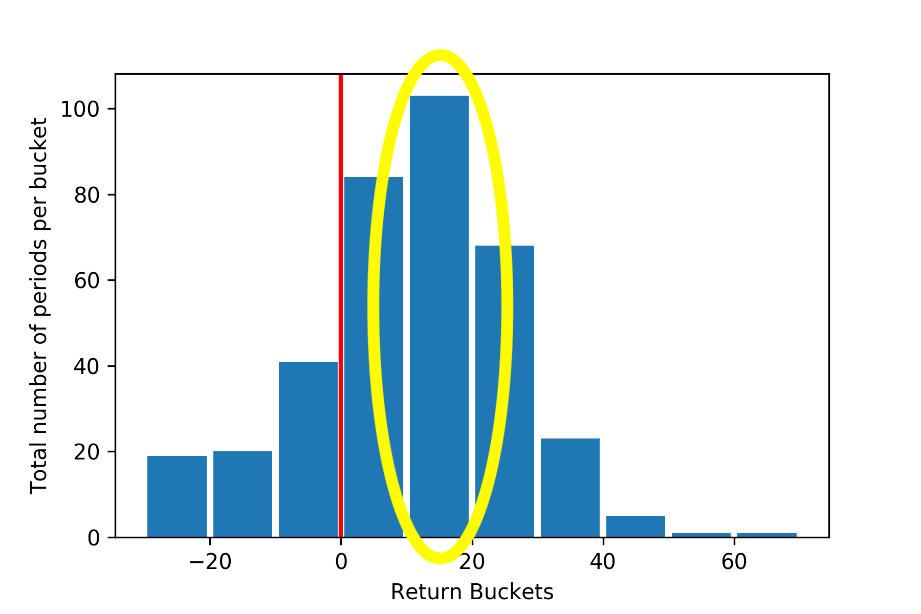
This histogram shows us that over a one-year investment horizon, the returns investors made were mainly in the range of 10-20%. In fact, the majority of the bars, particularly the big ones are to the right of the 0% mark - shown by the red vertical line - meaning that the returns were generally positive. This is called positive skew (*incorrect, skew is in relation to the average) and relates to what we said earlier: stocks tend to have asymmetric returns. Their returns are generally more positive than negative.
Let's look at this over varying time frames and see how the returns shape up. We are going to look at the returns spread for every single year up to 30 years. To make this a fair comparison, I have tweaked a few parameters such as changing the range of buckets and removing the gaps between the bars. This should hopefully make it easier to see the shape and compare between periods. I have also turned the results into a gif so you can easily see how the shape changes over time. Here it is:
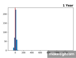
As you can see, as soon as we hit the 11-year mark the returns are all positive (to the right of the red line) and the returns shoot off to the right, indicating much larger returns. This is past data, so who knows whether the future will be different. However, this shows us that as investors, the longer we can invest for the higher our chances of having a good experience and make decent returns.
Some points I might add in the future:
- Doing the same analysis but using inflation adjusted returns
- Doing the same analysis but with a range of different asset classes